Since June I have been running a full DMAIC investigation, in public, on Malaysian graduate underemployment — the 32.2% of employed degree-holders working in semi-skilled or low-skilled jobs. Define closed in July. This month the Measure gate closed too.
Measure was supposed to be the boring phase. I already had the number. I had already computed a capability index on it in Define and published that. Measure looked like paperwork — confirm the figure, tidy the arithmetic, move on to the interesting part.
It was not paperwork. It changed what the case is about, and it caught me making a mistake I had written a rule against.
I had a target, and I had been calling it a spec
Every capability index I had published rested on an upper spec limit of 15%. Where did 15% come from? From my own goal statement in Define: reduce 32.2% to 15% by 2034.
That is not a specification. That is an ambition.
The distinction matters more than it sounds. A goal is what you intend to achieve. A spec limit is what the customer requires. If you quietly adopt your own goal as the spec, every capability number downstream measures the distance between reality and your personal ambition — and then reads like an objective fact about the world.
So before computing anything, I had to ratify the number as a spec and say what kind of spec it was. Three honest options exist: entitlement (best-in-class, what the best performer actually achieves), norm (what peers average), or voice of the customer (what the user of the process demands).
I ratified 15% as an entitlement spec, and I can now show my working. Against Eurostat's 2024 over-qualification data, the EU's best performer is Czechia at 12.8%, and the EU-27 norm sits at 21.5%. A 15% limit lands just above best-in-class and well below the peer average. It is a defensible entitlement.
The number did not change. What it means did. Every Ppk in this post now reads as distance from best-in-class, not distance from my own hopes.
Then: which 32.2%?
A spec means nothing until you name the population underneath it. And Malaysia's statistics office publishes this metric on at least three different constructions:
| Instrument | 2024 value | Population |
|---|---|---|
| DOSM Graduates Statistics (degree-only) | 32.2% | Degree holders |
| DOSM quarterly labour force series (all-tertiary) | 36.1% | ISCED 5–8, includes diplomas |
| DOSM's own international comparison chart | 32.3% | Not stated |
None of these is wrong. They answer slightly different questions. But you cannot compute a capability index until you have picked one and said so.
I picked the degree-only series — 32.2% — for continuity with the charter and with everything I had already published. Then I did something that felt like wasted effort at the time: I computed the capability index on both the degree-only and the all-tertiary series.
The all-tertiary series gives Ppk = −3.11. The degree-only series gives −3.14.
Two different populations, two different publications, two different sampling frequencies — the same verdict. That invariance turned out to be one of the most useful results in the phase, because the conclusion cannot be dismissed by arguing about which DOSM number is the right one. Whichever you prefer, the answer is the same.
The good year that wasn't
Here is the degree-only series, one population, one publication vintage:
| Year | Rate | Persons | Implied denominator |
|---|---|---|---|
| 2020 | 29.5% | 1.20M | 4.07M |
| 2021 | 33.8% | 1.45M | 4.29M |
| 2022 | 34.2% | 1.55M | 4.53M |
| 2023 | 32.4% | 1.54M | 4.75M |
| 2024 | 32.2% | 1.60M | 4.97M |
2020 stands out as the best year in the series. On the control chart built from all five points, it sits comfortably inside the limits — nothing to see.
But a point helps compute the limits it is then tested against. When I rebuilt the limits using only the moving ranges from the settled period, the average moving range dropped from 1.675 to 0.800, the limits tightened, and 2020 fell outside them. A special cause left inside the data inflates the variation estimate, widens the limits, and can therefore hide itself.
And the direction matters. 2020 sits below the process, which reads like improvement. It is not. This metric is a proportion of employed graduates. In the pandemic year, graduates left employment altogether — the denominator shrank. Read at face value, the 2020 dip credits COVID-19 with reducing graduate underemployment.
Removing the special cause made the process look worse
Having identified 2020 as a special cause, I excluded it and recomputed. Ppk moved from −3.14 to −6.06.
That looks like an error. It is not. Ppk is the distance from the process mean to the spec limit, divided by three standard deviations. Excluding an outlier shrank the standard deviation from 1.847 to 0.879 — it halved — while the mean stayed roughly eighteen points above the spec limit. A smaller denominator on an already-negative number makes it more negative.
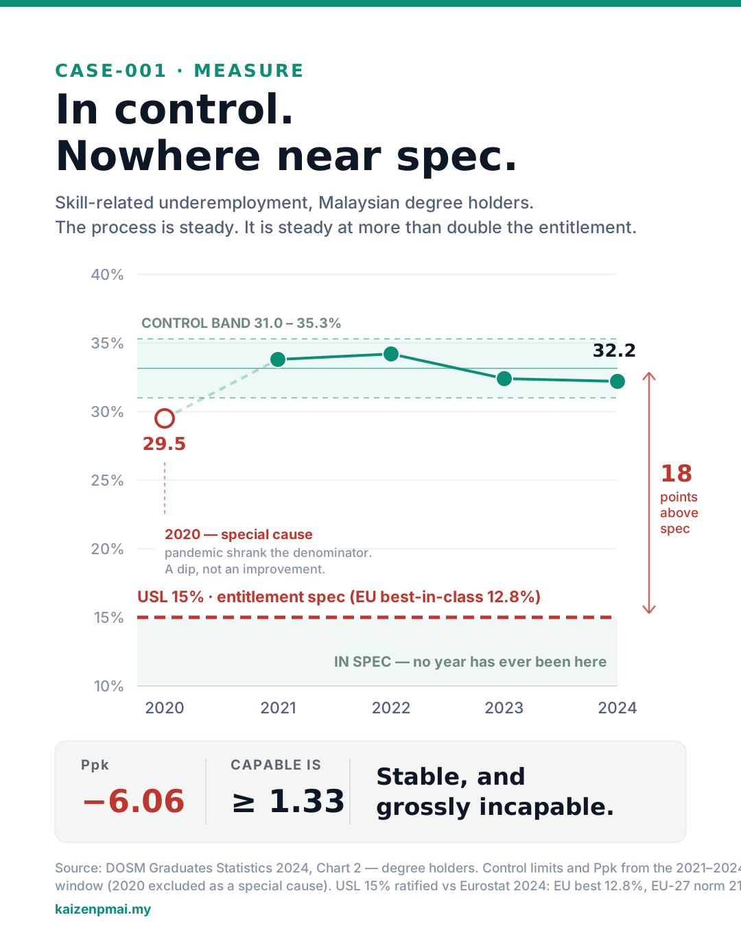 Control chart of skill-related underemployment among Malaysian degree holders, 2020 to 2024. The four settled years sit inside a narrow control band between 31.0 and 35.3 percent. The 15 percent spec limit sits about 18 points below that band, and no year has ever reached it. The 2020 value of 29.5 percent is marked as a special cause caused by the pandemic shrinking the denominator. Ppk is minus 6.06 against 1.33 or higher for a capable process. Verdict: stable, and grossly incapable.
This is the finding the whole phase turns on, and it is worth saying plainly.
I trained as a doctor before I worked in manufacturing, so the analogy that lands for me is a clinical one. A patient whose blood pressure is rock steady at 200 over 120 is not a well patient. The stability of the reading is not reassurance — it is the finding. The body is holding that value on purpose, defending it, returning to it. Homeostasis around a pathological set point is a more serious problem than a reading that swings, because nothing is going to drift back to normal on its own.
That is what the data says about Malaysian graduate underemployment. The system is not failing to control the number. It is controlling it precisely, at 2.2 times the entitlement level.
The practical consequence is a change of response. An unstable process invites firefighting — find the upsets, remove them, and things settle. A highly stable process sitting far outside spec cannot be fixed that way, because there are no upsets to remove. It requires redesign.
COVID was a step, not a spike
The annual series is only five points, which is thin. For the variation work I used the quarterly all-tertiary series — 35 quarters, 2017 Q1 to 2025 Q3, one vintage, straight from the live API. The invariance result above is what licenses that substitution.
Charting all 35 points at once flags 24 of them as out of control. That is not 24 special causes. When a control chart flags most of its own points, it is telling you the assumption behind it is false: the mean is not constant. Moving-range limits describe quarter-to-quarter noise, and this series spans a level change of nearly four points. The limits belong to no part of the process.
Splitting the series at the shift gives the real picture:
| Window | n | Mean | Ppk |
|---|---|---|---|
| Pre-COVID, 2017–2019 | 12 | 32.71% | −4.60 |
| Post-COVID, 2022–2025 | 15 | 36.57% | −9.89 |
All eight pandemic quarters breach the pre-COVID limits, and then the level stayed up. Pre-COVID mean 32.71%, post-COVID mean 36.57% — a permanent +3.86 point shift with no recovery.
In Define I had treated the 2021 peak of 37.9% as an excursion to be isolated. That was the wrong read. An excursion returns to the previous level; a step permanently re-levels the process and has to be adopted as the new baseline. Malaysia's graduate labour market did not absorb the pandemic and recover. It re-levelled about four points worse and stayed there.
Two smaller signals came out of the same chart and are now questions for Analyze. There is an upward breach at 2019 Q4, before the pandemic — the drift had already started. And there is a genuine downward trend since 2023 Q4, from 37.4% to 35.5%, the first sustained improvement anywhere in the series. I do not yet know what is causing it.
I asked for more data and then refused my own request
Five annual points is thin for a capability study. The obvious fix was to extend the series back to 2015 from earlier DOSM releases.
I tried, and then I refused it.
DOSM revises back-years between publications. The 2020 value was published as 31.2% (1.36M) in the 2020 and 2021 releases, and as 29.5% (1.20M) in the 2024 release. That is a 1.7-point revision to a single year — larger than several of the real year-on-year movements I would then have been interpreting.
Splicing those releases together would have put a publication event inside the data, in a position where any reader, including me, would read it as a labour-market event. A longer series would have looked more rigorous and been less true.
Every stratum fails
Stratification is normally the most hopeful step in an investigation. You break the aggregate apart, find the group that is doing well, work out why, and spread it.
Malaysia's open data publishes this metric broken down two ways: by age and by sex. Age has the obvious gradient in it, so that is where I looked first.
| Age band | Mean | Ppk | Verdict |
|---|---|---|---|
| 15–24 | 71.0% | −3.43 | Incapable |
| 25–34 | 41.7% | −4.99 | Incapable |
| 35–44 | 28.6% | −3.09 | Incapable |
| 45+ | 22.1% | −0.80 | Incapable |
Not one band meets the spec. The best performing group in the country — graduates aged 45 and over, deep into their careers — still sits seven points above entitlement.
On this cut there is no internal benchmark to copy and no local success to scale. When every band fails, the defect looks systemic, and "find the good one and roll it out" is not available as a strategy.
I wrote that up as a systemic finding. And next to it I wrote something that was not true: that age was the only stratum the open data allowed.
It was not. The sex cut had been sitting in the same catalogue the whole time — and I had verified that myself, two sections earlier in my own record, while closing off a different data question. I simply never ran it.
So I ran it.
Neither band meets spec either. The better of the two still sits more than eighteen points above entitlement. The systemic conclusion got broader, not weaker.
That was the outcome, not a foregone conclusion. Running the second cut was the cheapest falsification test available for my own headline, and it could just as easily have produced a group worth copying. A "systemic" verdict is only ever as strong as the number of cuts you actually ran — leaving one unrun does not make the conclusion safe, it makes it untested.
That cut did surface one genuine difference between the two groups, large enough that the measurement system can actually support it — unlike the between-country gaps I had to withdraw earlier this year. I am holding it back from this write-up on purpose. It is a description with no explanation attached to it yet, none of the causes I screened predicts it, and a number like that put into circulation without a verified mechanism gets explained for you, confidently, by people who have not looked at the data. It goes in the case record now and into the post that can say what causes it.
The honest limit on all of the stratification: it rests on age and sex. Two demographic cuts, neither of which identifies a producer. The cut I actually want is by university and by field of study, and no public source disaggregates this metric that way. It remains entirely possible that some institution or some discipline is quietly getting this right and would be the benchmark worth copying. I cannot see it, because nobody publishes it — and that absence is itself something the next phase has to deal with.
What the measurement system can and cannot do
The last gate criterion is measurement system analysis, which here is a reproducibility problem: several instruments measuring one characteristic. Adding up the sources of spread — population boundary 3.9 points, publication vintage 1.7 points, age window up to 3.7 points, plus genuinely different constructions — the instruments disagree by roughly 4 points.
Is that acceptable? The honest answer is that the question is malformed.
Against a process sitting about 20 points outside its spec limit, a 4-point instrument spread is comfortably adequate. The "grossly incapable" verdict survives every instrument choice, as the −3.11 versus −3.14 result already demonstrated.
Against 1 to 2 point gaps between countries, the same instrument cannot rank anyone at all.
I know that second part from experience rather than theory. Earlier this year I published a cross-country comparison off this data and had to withdraw it, because the differences I was ranking were smaller than the differences between the instruments doing the measuring. A measurement system is never simply acceptable. It is acceptable for a specified question, and you have to name the questions it cannot answer.
And then I broke my own rule
One of the findings from this phase became a written rule: never report a defect rate without its absolute count and the growth of the denominator, because a rate can fall while the burden rises, and publishing either alone is a selection rather than a summary.
Ten days later, re-running my own scripts before writing this post, I found that I had broken it in the paragraph that states it.
What I had written was: the rate fell from 34.2% to 32.2% while the absolute count rose every single year, from 1.20 million to 1.60 million — a 33.3% increase.
Three things wrong with that sentence.
The rate movement is measured over 2022 to 2024. The count movement is measured over 2020 to 2024. Two different windows, presented as one movement. Over the window that produces the headline 33.3%, the rate did not fall at all — it rose, from 29.5% to 32.2%. The number I was using as evidence came from a window that contradicts the claim it was supporting.
The count also did not rise every single year. In 2023 it fell, from 1.55 million to 1.54 million.
Stated properly, on one window, excluding the 2020 special cause exactly as the baseline does: between 2021 and 2024 the rate fell 1.6 points, the count rose 10.3%, and the denominator rose 15.8%. The finding survives. The rate really does improve while the burden grows, because the graduate population is growing faster than the mismatch is shrinking. It is simply about a third the size I had claimed.
My rule said to report the count and the denominator alongside the rate. It did not say that all three have to run on the same window. So that is now a separate rule.
It was not the only thing that re-run turned up. I also found a ratio I had written in words and never actually calculated — I had described the process as running at "roughly three times" the entitlement level, and when I finally divided one number by the other it was 2.2 times. Not a small thing to have repeated in three files. And I found the unrun sex cut described above.
Three defects, in a phase whose five exit criteria had all been satisfied for ten days, in a record I had read through several times. Reading found none of them. Reading a phase record tells you whether it is coherent — and a confidently wrong figure is perfectly coherent. Only re-running the computation tests the claim.
So the tollgate rule for this project changed as a result. A gate review re-derives, it does not re-read. Re-run every script the phase produced and diff it against what the record says. Treat any number that appears in prose but in no script as unproven by default, and treat ratios stated in words as the riskiest class of all. Then sweep everywhere else the claim has propagated, because it always has.
Nothing had reached print. That is the only reason this is a footnote rather than a correction notice.
Where this leaves the case
The Measure gate is closed. What it established:
- The process is not stable — COVID was a permanent step change, not an excursion.
- It is grossly incapable on every instrument, every population, and both available strata.
- The verdict is invariant to which official number you choose.
- The measurement system is fit to judge capability and unfit to rank countries.
- The rate is improving while the absolute burden grows.
The single sentence I would keep out of all of it: Malaysia is not failing to control graduate underemployment. It is controlling it precisely, at more than double the level a graduate labour market should run at. That is not a firefighting problem. It is a design problem.
Analyze is now open, and it has a specific job: take the four candidate causes that survived the evidence screen and actually verify them against this data. Screening is not verification. That distinction is the next post.